Version 3.0 Updated 29 Oct 2018 Approx 1.5 MB (zipped)
This is the second in a series of examples showing different ways of filtering and grouping data in Access
This example demonstrates a typical patient login system similar to that used in my local medical practice. It is used on a touch screen with no keyboard and is designed to occupy the entire screen (kiosk mode).
The startup form provides various options for testing/using this application.
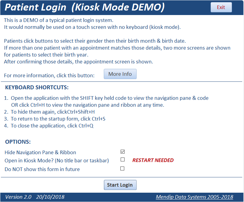

The challenge when creating kiosk mode applications is to design forms that guide the user through all possible scenarios in as few screens as possible in order to filter the data down to a single unique record.
Large font sizes and large buttons are always used in kiosk mode apps for ease of use on touch screens.
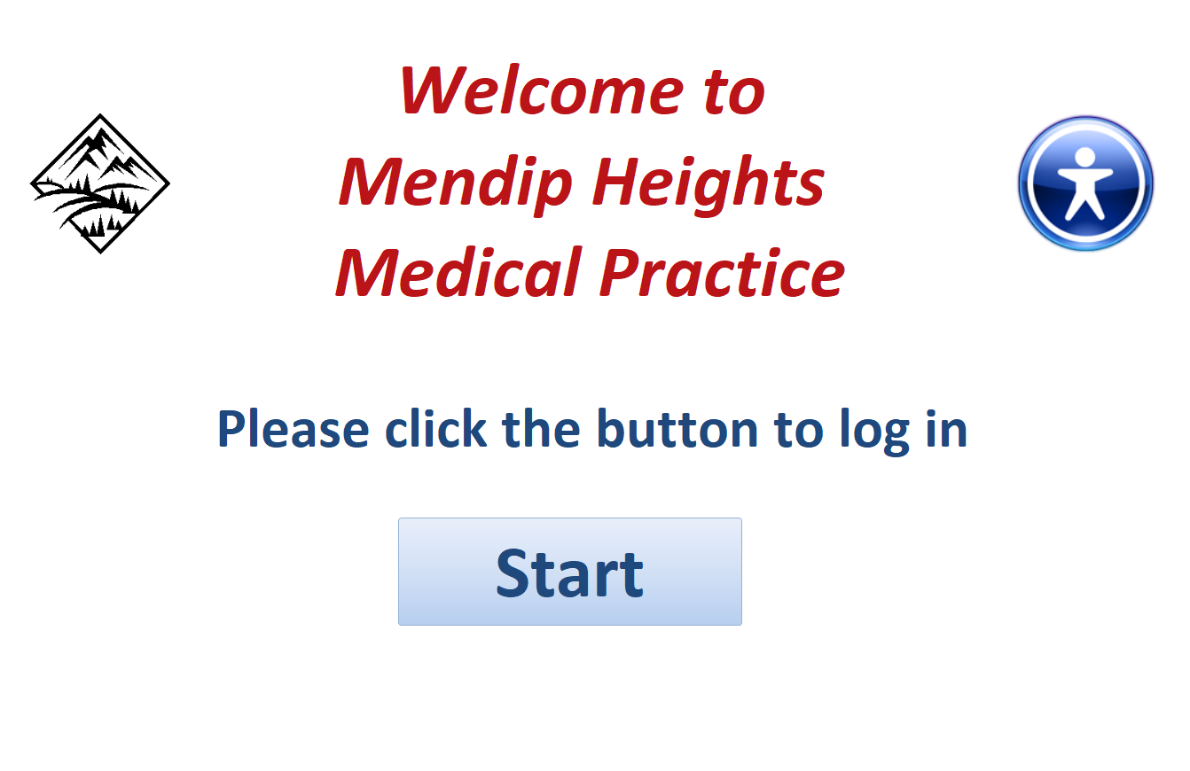
Patient Login - Start
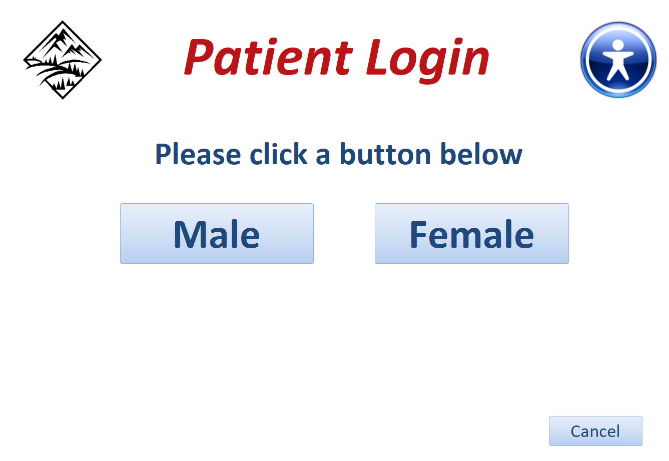
In this example, users first select their gender then their birth month & birth date.
Patient Login - Gender
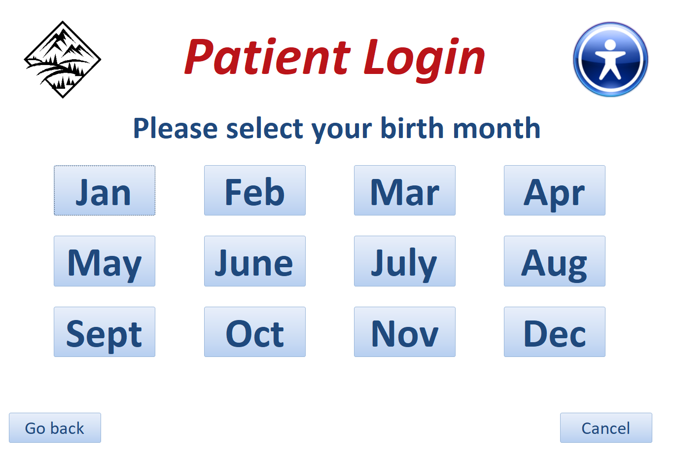
Patient Login - Day
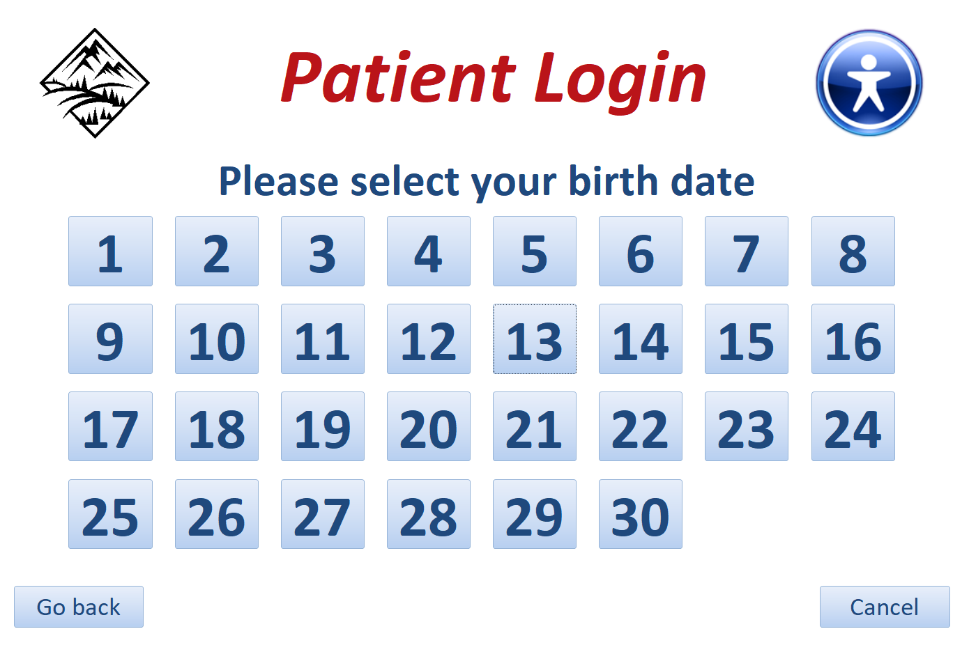
The application then checks the list of appointments for the current date
If there is only one record matching those details, a confirmation screen appears.
Patient Login - Check
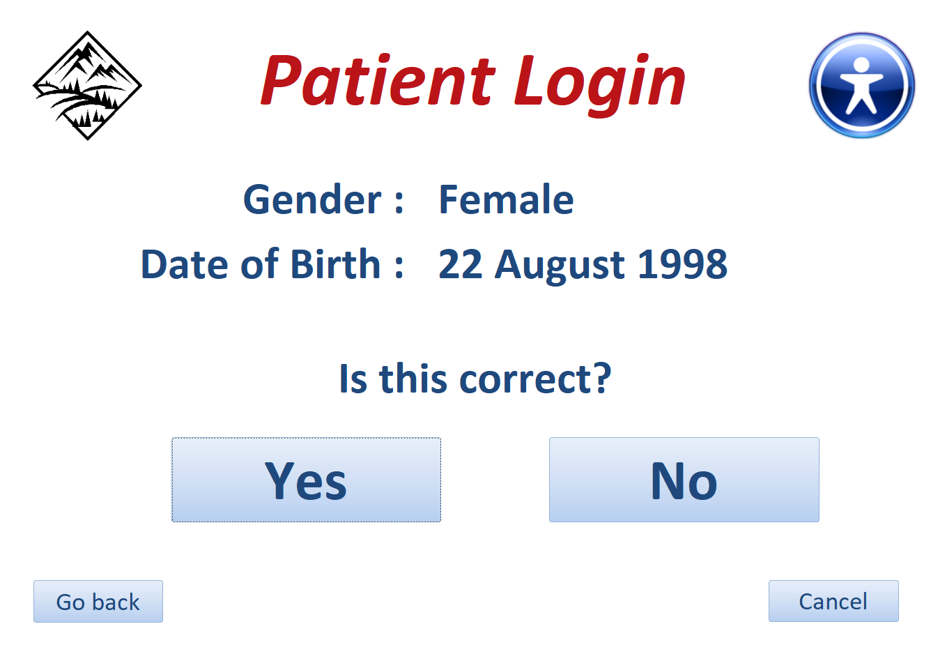
If the details are incorrect, click No to return to the Login screen and start again
Click Yes if the details are correct and the appointment details are then displayed
Patient Login - Appointment
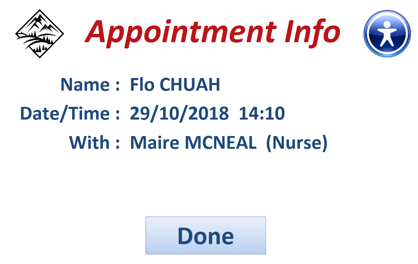
When the Done button is clicked, the app returns to the login screen ready for the next user.
The login time is saved in the appointments table. This provides an easy method of checking for non-attenders as their login time will be blank
There are several variations in the process depending on the outcomes.
For example, two or more patients with the same gender and birth month/date may have an appointment that day.
If so, two additional screens appear so that the year of birth can be selected.
Patient Login - Decade
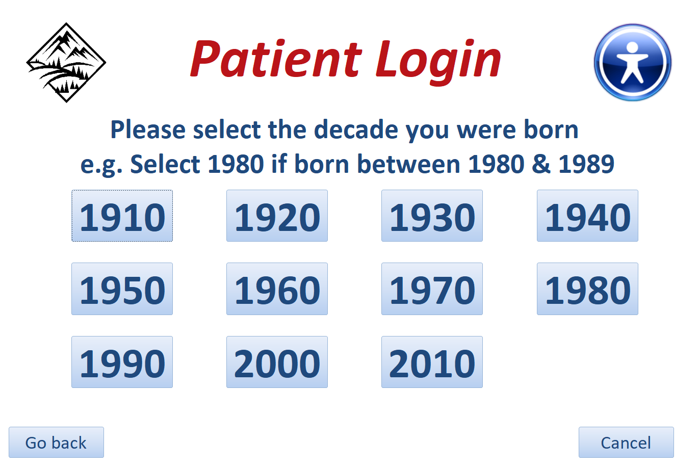
Patient Login - Year
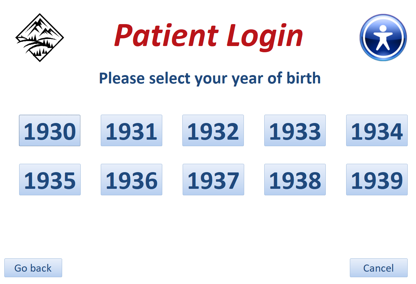
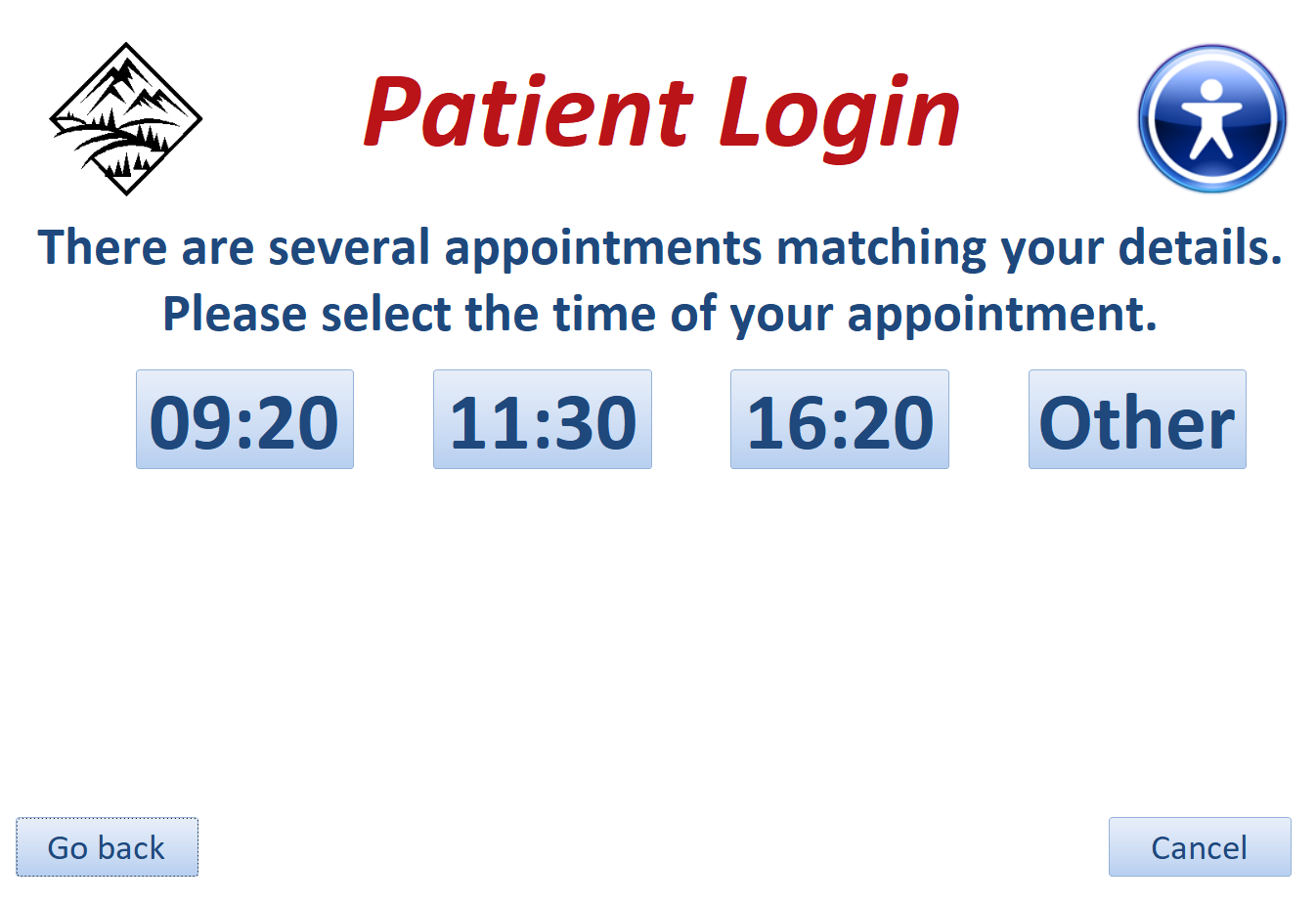
On the very rare occasions that two or more patients with the same gender and date of birth have an appointment that day, the application selects all the related appointment times for that day and displays these for the user to make a final selection.
Patient Login - Time Check
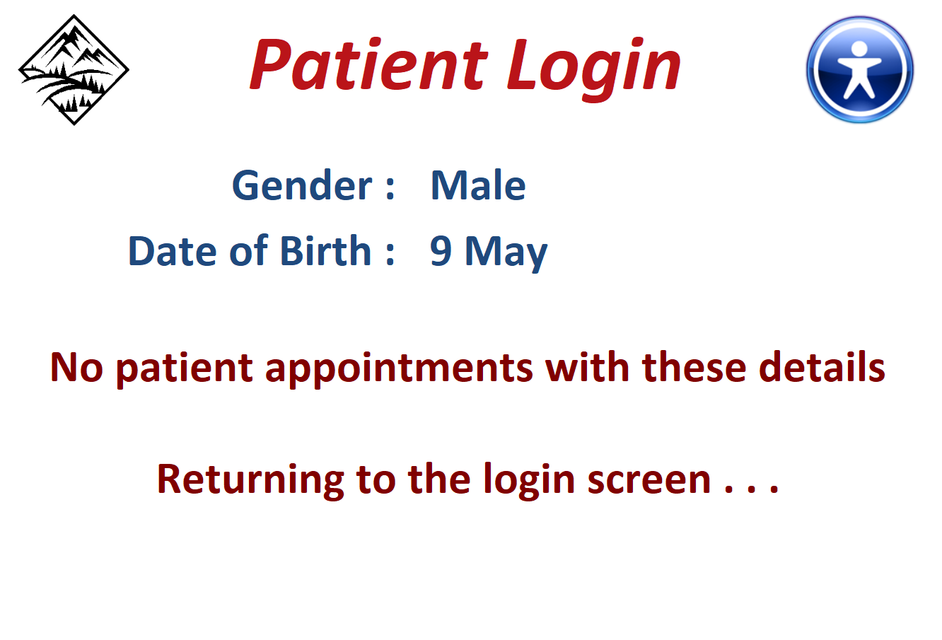
If no matching details are found, the app will state this & then return to the login screen ready for the next user.
Patient Login - Check Failed
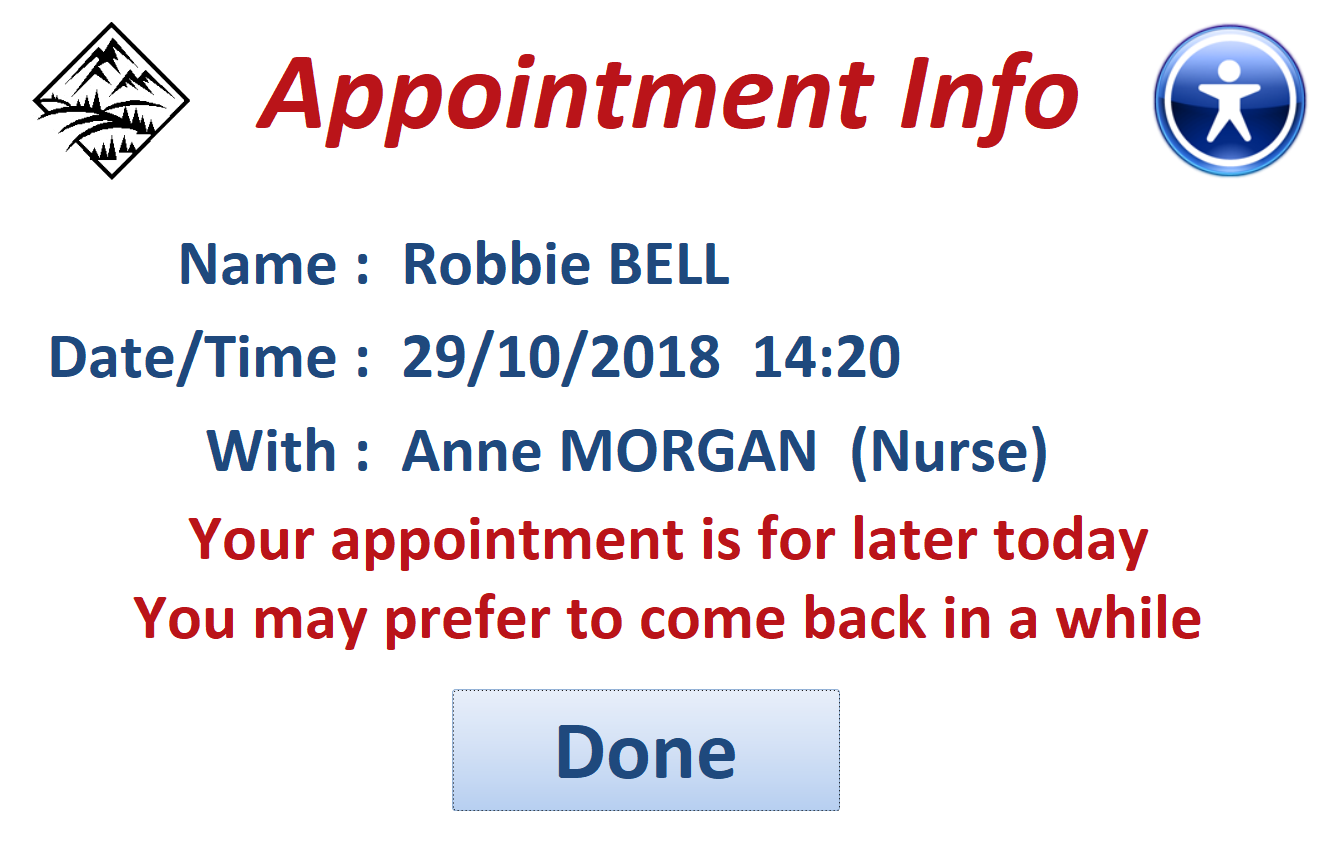
If the appointment is much later in the day, a different message appears.
Patient Login - Later Appt
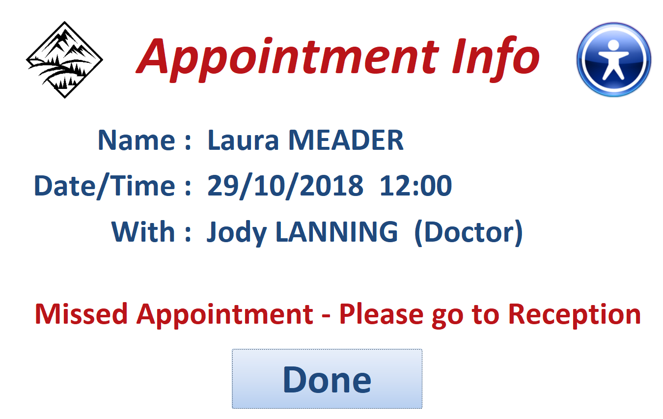
If the time was earlier in the day, a missed appointment message appears.
Patient Login - Missed Appt
The PDF file supplied with the app gives full details of all the different routes possible using the app.
The PDF file should be saved in the same folder as the application.

Further info:
The DEMO application contains over 3300 patients and over 530 appointments for the same date.
To make this as realistic as possible for testing purposes, the following changes are made to the records in the appointments table when the application is started:
a) All appointments are changed to the current date
b) All login times for dates other than today are cleared

Keyboard Shortcuts: (for the purpose of this DEMO only)
a) Open the application with the SHIFT key held down to view the navigation pane,
ribbon & code
OR click Ctrl+H to view the navigation pane and ribbon at any time.
b) To hide the navigation pane & ribbon again, click Ctrl+Shift+H
c) To return to the startup form, click Ctrl+S
d) To close the application, click Ctrl+Q

Download
Click to download: Patient Login v3 Includes both ACCDB & PDF files (zipped)

Feedback
Please use the contact form below to let me know whether you found this article interesting/useful or if you have any questions/comments.
Do let me know if you find any bugs in the application.
Please also consider making a donation towards the costs of maintaining this website. Thank you
Colin Riddington Mendip Data Systems Last Updated 29 Oct 2018

|
Return to Example Databases Page
|
Return to Top
|