Version 1.3 Approx 1.2 MB (zipped) First Published 17 Sept 2025
Adding marker lines to charts can be very useful. For example, to add a target line for medical data.
This article explores two methods of doing this - each with its own advantages & disadvantages

1. Using a Combo Chart
I first explored this approach in an earlier article from 2023: Using Combo Charts in Access
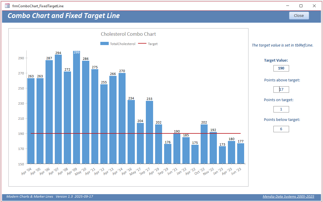
In this case a combo chart has been used with the blood cholostrerol level shown as column data together with a line for the target data.
The target line was a single data value in a separate table with a query based on a cartesian join for the chart row source.
For full details on how this was done, see my previous article.
Simple DCount expressions are used to determine the number of points above / below / on target.
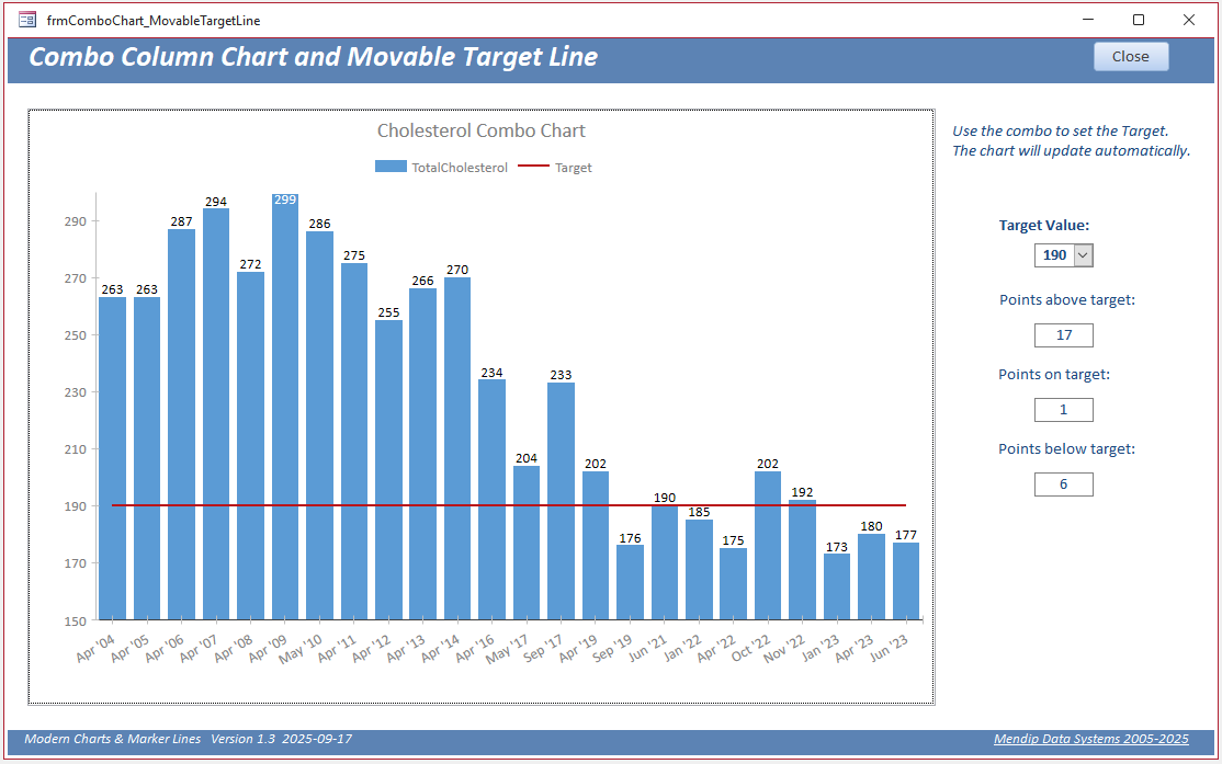
The target level can easily be altered at runtime using a combo box:
The same idea can be used with other chart types such as a line chart:
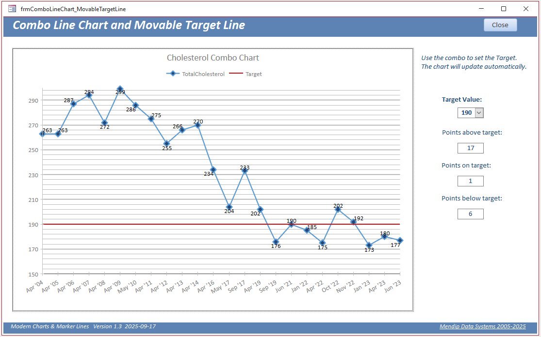
In this case I have added major/minor gridlines to the chart - a feature that wasn't available back in 2023.
The main advantage of this approach is that its simple to achieve.
However, it has some disadvantages such as users cannot show / hide the marker (target) line at runtime without modifying the chart row source.
2. Using a Line Control Overlay
A different approach is possible using a marker line that is not part of the chart but placed on top of it.
That approach is easy to do with the old classic charts. However, until recently, I believed this was impossible to do with with modern charts as these are windowed controls.
The properties of windowed controls (modern charts, subforms, listboxes and browser controls) are such are they SHOULD ALWAYS appear on top on non-windowed controls
e.g. lines, no matter how you arrange them in design view.
In this screenshot, I have attempted to place the chart at the back and target line at the front.
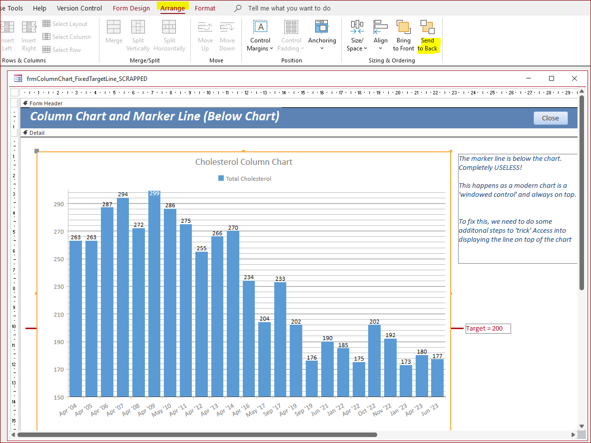
However, the modern chart always get moved to the top in form view:
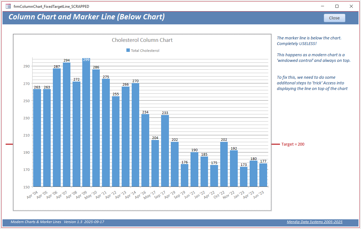
Clearly this is absolutely unfit for its intended purpose.
However, whilst answering a question on this topic from a former MVP, Dale Fye, I accidentally found a method of placing the line on top as required here.
To get this to work there are two requirements:
a) There must also be a classic chart control on the form. It can be placed anywhere on the form and must be visible. However it can be set to zero width and height so it isn't seen.
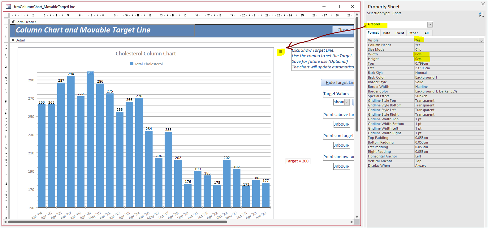
I have absolutely no idea why this works but somehow having the classic chart control 'tricks' Access into overwriting the properties of the windowed control.
b) An action must be done AFTER the form loads to reverse the z-order and bring the marker line to the top. Suitable actions are:
• Resize the form either by dragging the form border or maximizing
• Resize the form using automatic form resizing code on a Form_Timer event
• Start with the line hidden and make it visible e.g using a button click (or a Form_Timer event)
NOTE: After any design changes, arrange the chart control to the back / line control to the front.
For full details, see my article: Windowed & Non-Windowed Controls in Access
In this example, I use a button click event to make the line visible after the form loads and, in doing so, bring it to the top.
This is the result in form view after the Show Target Line button is clicked:
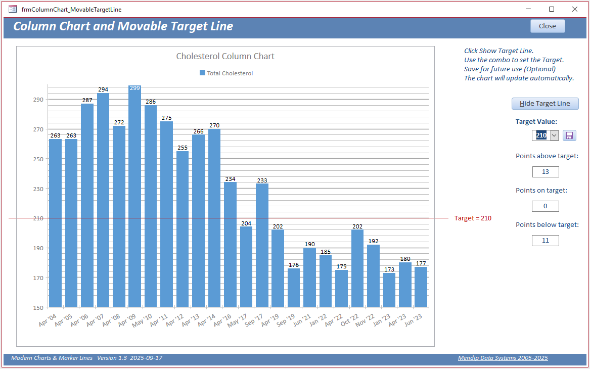
Note that as the line control is independent of the chart, it is necessary to specify the postion of the line for each possible combo chart value.
To do this, I have created a separate table tblLinePosition and manually assigned the required values:
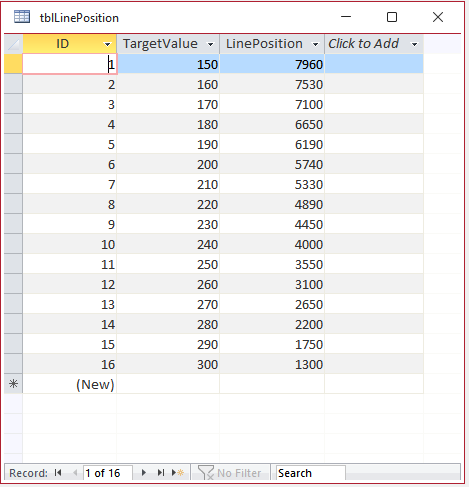
Having done this, I wanted to take the example app one stage further.
Back in April 2024, the Access team discussed their future plans at the Access DevCon conference. As part of this, they discussed development plans for the modern chart improvements.
This is a slide taken from that presentation:
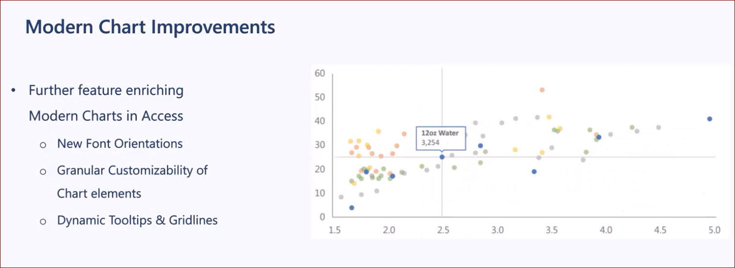
Now that feature would have been really cool . . . but unfortunately it didn't get implemented.
So I decided to see if I could add a similar feature with chart data point labels to the modern chart.
This is the result with an added vertical line used to select individual data points.
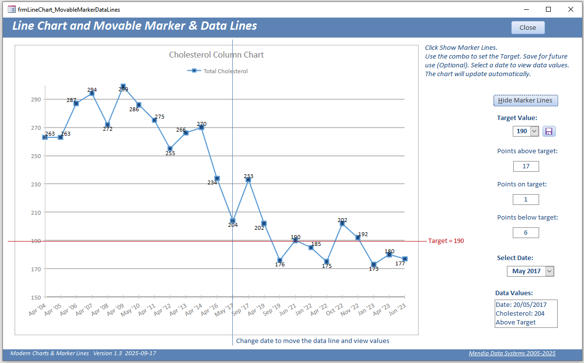
Once again, the vertical line postion was determined manually for each data point and saved in a table which is referenced in the query below.
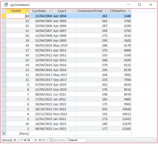
NOTE: There is (hopefully) a better way of getting these values. Any suggestions for doing so would be much appreciated!
With these values, the second combo box is used to select individual data points by date.
The data point values are displayed at the bottom right of the form together with an above / below / on target comment.
Here is the same form after changing both the data point and the target level using the two combo boxes. In ths case, the selected point is below target.
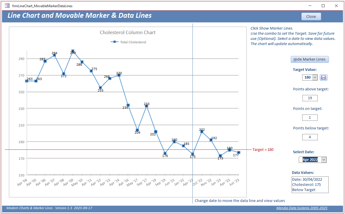
The approach can be used with any suitable chart type and with multiple data series. I would be very interested to see how other developers make use of these ideas in their own apps.
It is obviously more compicated to design than the first method but provides additional functionality.
Users are also able to show / hide the marker lines using a button click at runtime as preferred.
NOTE: Whilst testing this final step, I tried several veriations with mixed results:
a) Using drag and drop to move the vertical line - this worked erratically with the line difficult to control and it often moved to the back
b) Using left / right 'nudge' buttons to move the vertical line by small amounts - this worked reasonably well but would in practice be too slow for end users to traverse the chart
c) Placing the data values label over the chart next to the selected data point. This failed completely. The label remained hidden behind the chart.
Video
I have created a YouTube video (14:46) to demonstrate the different methods of adding marker lines to modern charts.
You can watch the Add Marker Lines to Modern Charts video on my Isladogs YouTube channel or you can click below:
If you liked the video, please subscribe to my Isladogs on Access channel on YouTube. Thanks.
Download
Click to download: Modern Chart Marker Lines v1.3 ACCDB file (zipped)
None of the code used in this example app is complicated and there are detailed comments to explain each step used.
Feedback
Please use the EMail button in the contact form below to let me know whether you found this article interesting/useful or if you have any questions/comments/suggestions.
Please also consider making a donation towards the costs of maintaining this website. Thank you
Colin Riddington Mendip Data Systems Last Updated 17 Sept 2025
|
Return to Example Databases Page
|
Return to Top
|